|
|
Document 618
Shading regions in graphs
Version: 4.x & 5.0 - Scientific WorkPlace & Scientific
Notebook
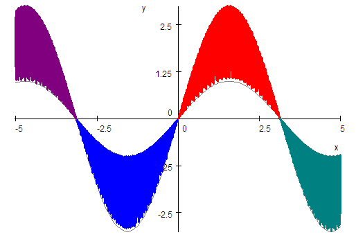
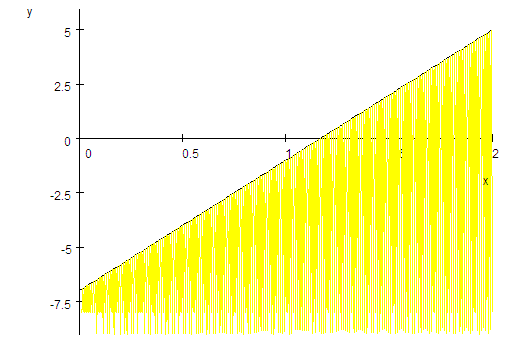
You can shade regions in SWP and SNB plots by creating quasi space-filling
curves. The method we illustrate with the first example below works on regions
where
 is the bottom curve. The second example illustrates shading a region below
 .
Adapt the methods to your needs. .
Adapt the methods to your needs.
-
From the Tools menu, choose
Computation Setup.
-
Choose Plot Behavior, select
Recompute Plot When Definitions Change, and
choose OK.
-
Define
 and plot the function.
-
Define
 . .
-
Select
 and drag it onto the plot.
-
Define
 or choose some other high number.
You may need to experiment to find an appropriate number for your needs.
-
Select the plot and choose Properties to open
the Plot Properties dialog.
-
For each expression, set the plot color and line thickness you want.
In this example, we plotted
 and
and
 with a thin gray line.
-
Add four new expressions to the plot:

-
For the first new expression,
-
Use the Item Number box to select the
expression.
-
Set the plot color you want.
-
Set the line thickness to Thick.
-
Choose Variables and Intervals.
-
Set the
 interval to -3.14 to
0.
interval to -3.14 to
0.
-
In the Points Sampled box, enter
875 or some other number greater than
 and less than 1000.
Again, you may need to experiment to find an appropriate number of samples.
-
Choose OK.
-
Repeat step 8 for the other three new expressions, setting the
 intervals to 0 to
3.14, -5 to
-3.14, and 3.14 to
5, respectively.
intervals to 0 to
3.14, -5 to
-3.14, and 3.14 to
5, respectively.
-
Choose OK.
You can use the same process to shade a region below
 .
For .
For
 use a constant value less than the minimum value of
 for the plot. Here we used
 and set
 . .
Last revised 07/14/07
|